[GRM+ members read this article first. Subscribe and gain access to more exclusive content for only $3/month.]
Whenever we publish a story on data acquisition, we fill it with catchy language like “Data acquisition is more accessible and affordable than ever!” And it’s true. But that proclamation doesn’t really help someone who’s never used data acquisition before, or someone who’s dabbled but is still working to separate the signal from the noise when it comes to interpreting those wavy lines.
So let’s talk about turning those squiggles into speed. What, exactly, should you pay attention to, even if you have just minutes or even seconds to review your data in between sessions?
For this discussion, we’ll focus mostly on using data acquisition to tune your driving, not necessarily your car. Data collection aimed at car tuning generally requires a bit more hardware and complexity, but we’ll touch on that, too.
The cool part about data collection for driver analysis is that the simplest outputs can provide a wealth of information. Even the most budget-friendly data-acquisition hardware and software can output a speed graph, and that one shot, even at a quick glance, can aid driver improvement.
Speed/Distance: Data’s Building Block
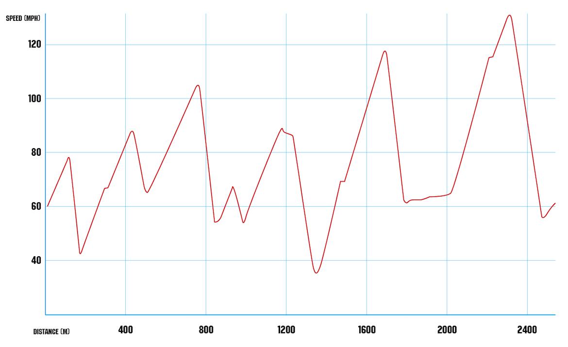
First, let’s talk about what we’re going to look at most commonly, which is either a speed/distance graph or a speed/time graph. A speed/distance graph displays the speed of the car on the y-axis and the distance the car has traveled on the x-axis. A speed/time graph replaces that distance axis with time. Basically, they’re both plotting a car’s speed along its path around the track.
You’ve probably already figured out that each type of graph will produce slightly different results. Displaying two laps on a speed/distance graph will overlay the laps directly on top of each other, allowing you to read the speed of the car at specific points on track regardless of when it happened. The speed/time graph will display the laps as they occurred in time, and typically that will result in one graph being shorter than the other.
When comparing two laps in the same car, a speed/distance graph is generally more relevant. You can instantly see speed variances in specific corners–down to actual points through those corners–and easily compare them to each other.
With a speed/time graph, the diverging traces provide a pretty good idea of where you’re gaining time at specific points on track, along with how those gains affect speed at subsequent parts of the track. A speed/time graph is usually a great object lesson in the fact that nailing one corner pays dividends not just in that turn, but for a good portion of the track beyond that–basically until you screw up again.
For quick reference, we’ll mostly reach right for that speed/distance graph, but what exactly will we be looking at? Typically, a speed/distance graph looks like a triangle or sawtooth wave, with alternating peaks and valleys showing the car accelerating and decelerating as it negotiates the straights and corners. For most cars, the rising part of the wave is less steep than the falling part–nearly all cars can brake harder than they accelerate, so they lose speed faster than they gain it–and constant speed sections display as horizontal lines.
Let’s start our quick scan by looking at those peaks and valleys, because there’s a lot of information to glean just from how the up slope turns into the down slope.
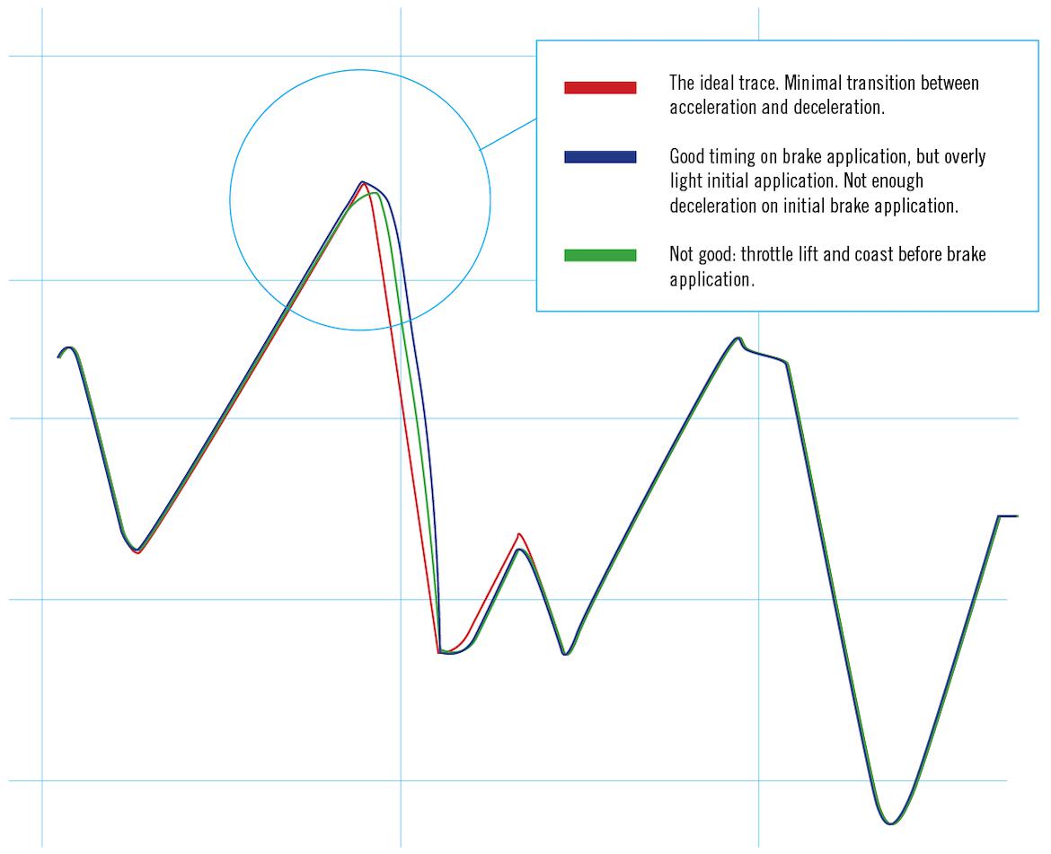
At the top of the graph, we see a graphic representation of our driver lifting off the throttle and applying the brakes to decelerate for a corner. Ideally, this part of the graph should be very sharp: acceleration rising to a peak and then instantly turning into deceleration.
If you don’t see a sharp peak, a few situations might be costing you speed. An acceleration curve that plateaus before rapidly dropping is indicative of a driver lifting the throttle early and coasting toward the braking zone. Naturally, nearly all cars will have acceleration curves that become less steep as speed rises and the car needs to overcome increasingly taller gearing and higher air friction. But those flat lines before the braking zones are telltale signs of early lifts.
Conversely, a graph that steadily rises but then begins dropping in a convex curve before rapidly angling down indicates an overly light initial brake application.
No matter which side of the peak that gradual curve falls on–and especially if it’s on both sides of the maximum velocity–it’s a red flag. Quick laps do not care for inaction or coasting, and a nice sharp peak at the top of that velocity curve is a much better indication that you’re wringing the max performance out of the car.
Now let’s go to the bottom of that curve. The basics here are similar, but the nuances become more, well, nuanced. The trough of a speed/distance curve shows the moment the driver stops decelerating and transitions back to throttle to accelerate through and out of a corner.
These troughs, when driving inputs are properly executed, will follow some patterns. One generalization we can make is that slower corners with a single apex tend to show up as sharper points. This is a result of decelerating toward the turn-in point, setting the arc, and throttling out. More complex corners have–you’ve probably already guessed–more complex speed traces, but we’re dealing with generalities before diving too deep into the weeds.
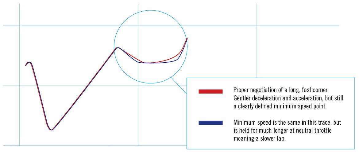
Another generalization we can make is that faster corners have more rounded troughs. In these corners, you’re slowing more gently, managing that weight transfer and load on the tires, then accelerating through and out with less thrust, as you’re likely in a higher gear.
Red Flags
With different types of corners naturally having different-looking traces, what are some of the red flags we can look for? Well, the first and easiest to spot are spikes. A downward spike after the curve that has bottomed can be an indication of a too-fast entry–either because of too much velocity or too little confidence–resulting in an abrupt lift or even a brake application after turn-in.
On the climbing portion of the graph, look for upward slopes that suddenly level or plateau–even just momentarily. This can be indicative of lifts after the apex, or even of wheelspin as acceleration pauses for an instant.
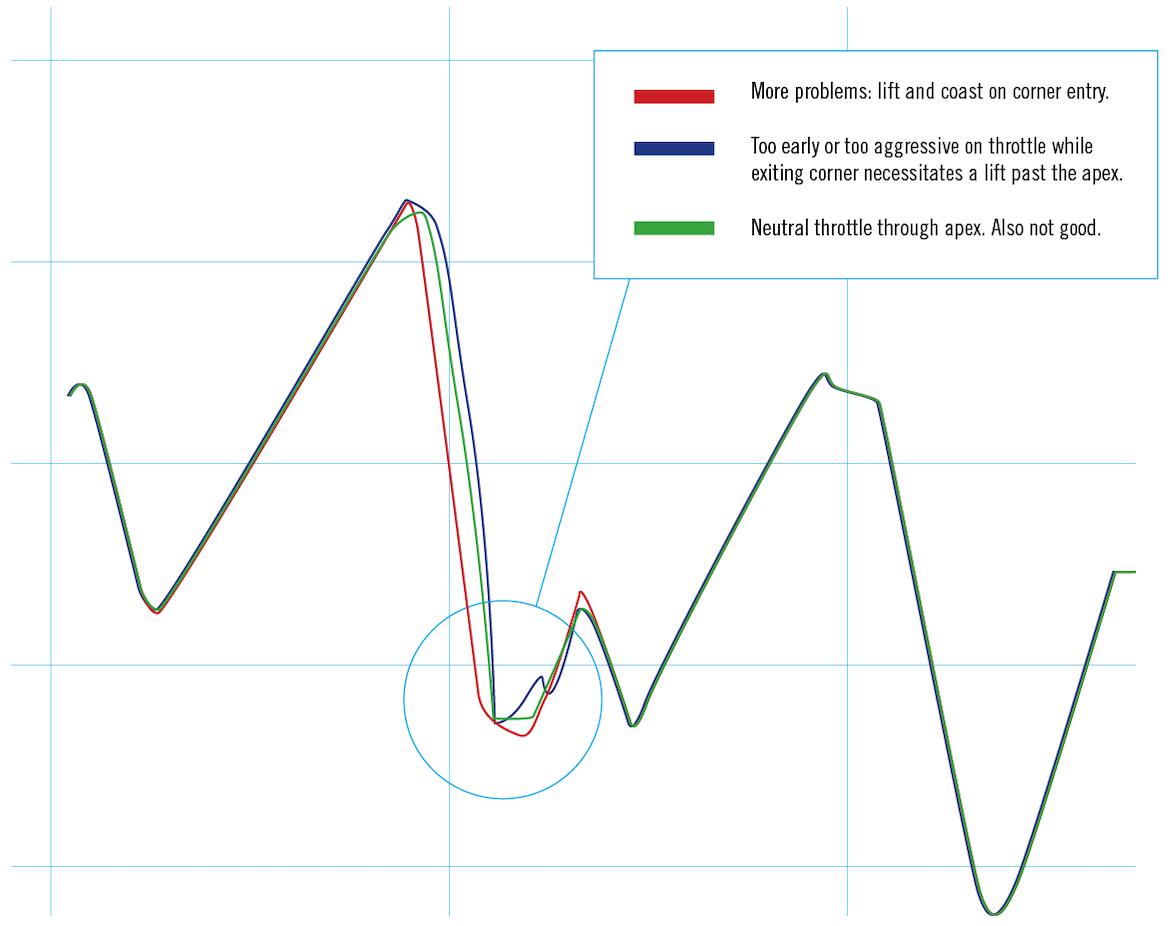
What about the creamy middle of those traces? Is there anything we can learn from those long slopes in the acceleration and braking zones? Yep, plenty, and most of it will come from the steeper, braking side of the trace.
Ideally, the deceleration trace should look fairly straight, showing a constant rate of deceleration as the car approaches the corner. Cars with lots of aero may have a naturally steeper initial deceleration curve, as the additional downforce at higher speeds allows for more traction and decelerative force. In general, though, that line should be straight–or at least a consistent, maybe slightly concave curve.
Just as we saw on the acceleration side of things, any areas of sudden flattening or noticeable bumps are cause for investigation. Frequently, wheel lockup appears as a quick flattening as brake pressure is momentarily released to get the wheel turning again. Overly aggressive ABS intervention can manifest as a slowing deceleration rate, and sloppy heel-toe work can show up as anything from a small, jagged blip to a complete shift in the deceleration rate and a change in the curve’s shape.
Acceleration traces, on the other hand, typically look highly convex–except when the car has tons of power and traction. Acceleration rate tends to drop off at speed as decreasing gear leverage and increasing drag fight horsepower. Still, there are a few things we can learn, even after the all-important corner exit.
First, a glance at the entire trace can reveal some problem areas–most notably, any place the line goes horizontal. Even the longest, most geometrically consistent corners tend to have entry, apex and exit points, so any horizontal traces should be analyzed for potential gains. Yes, long turns like the Carousel at Road America or the Karussell at the Nürburgring will require some area of speed maintenance, but in general, if you’re seeing a horizontal line, you might want to ask why it’s there in the first place.
And let’s look at shift points. In cars with manual transmissions, a shift point typically displays as a momentary flattening of the acceleration curve. During those moments when the driveline has been completely decoupled by the depressed clutch pedal, no acceleration is possible.
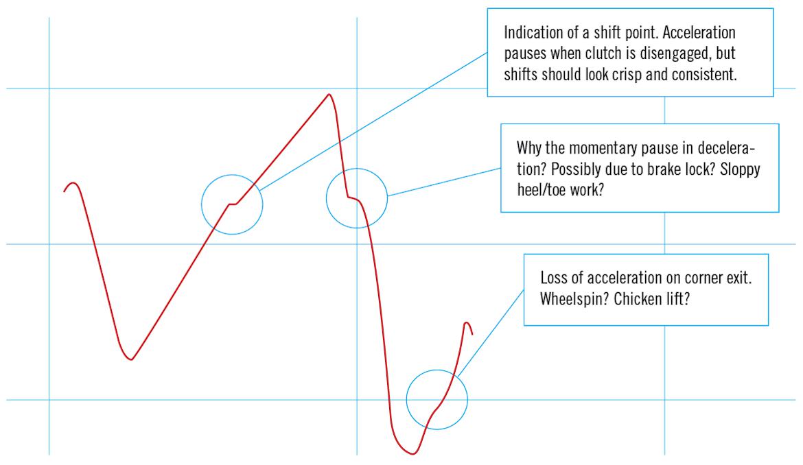
While there isn’t much you can do to eliminate those gear changes, you can examine them for further gains. Is your two-three shift, for example, longer or shorter than your three-four or even four-five shift?
Once a shifting plateau ends, does the line return to a consistent rising trace, or is there a wiggle in the curve? That wiggle can reveal a mistiming of throttle application when reengaging the clutch. Or maybe you’re reengaging the clutch too abruptly or too slowly.
Going Further
Now we know how to glean a ton of information just from a speed trace, but what happens when we add more sources of data to the mix? Can we still get quick driving feedback between sessions?
Well, yes.
While collecting more data certainly ups the complexity level, a couple of dynamic inputs can provide a 1000-foot view of the situation. We find that the best tool for this is the friction circle, which is generated by plotting lateral and longitudinal g-loads on a circular graph.
On a friction circle graph, the x-axis indicates lateral g and the y-axis indicates longitudinal g. This data can be viewed either as a moving dot over time or as a cloud of dots taken at multiple sample points throughout a lap.
The key red flag: any activity in the middle of the circle indicates that the car isn’t doing much of anything. Likewise, the friction circle provides a great way to gauge your transitions in and out of corners, as ideally the dot indicating the g-loads is riding around the outside of the circle, indicating that any loss in longitudinalg is replaced with a gain in lateral g–and vice versa. If the dot is moving through the center of the circle between longitudinal and lateral loads, it’s a good sign that brake or throttle applications aren’t smoothly blending with the corners’ entries and exits.
We’ve hit nearly 1800 words at this point and we’ve barely scratched the surface on this topic. The takehome message: You can pull practical driving feedback from even a cursory glance at the simplest of data sources.
